A possible misconception about creating aging in place improvements or designs is that they need to address the specific needs of the client in ways that are noticeable to the client – and others. We know that if someone has a ramp installed when it wasn’t there previously that it going to be an obvious improvement – at least in the short-term. However, depending on how it is installed, its placement on the property, and any landscaping or other design treatments that are used to soften its appearance and provide a little privacy for the user, it does not need to garner all of the attention as the main thing that someone notices as they approach the property.
Ramps are becoming quite popular and rank as one of the most requested and completed aging in place projects. Nevertheless, they can be constructed in a way that allows them to blend into the home’s exterior design as an integral part of it rather than something that has been added.
This is the point of effective aging in place design and how universal design as a strategy helps us to implement changes that our clients need without calling attention to those changes. We want our clients to function well within their living space (and the area immediately around their home), and we can create improvements that are integrated into the home’s design rather than appearing as an addition – inside or out.
Safety considerations are a classic example of this. We can go through a client’s home and make several safety improvements that allow them to live in their home more effectively but aren’t necessarily obvious or even noticeable. For instance, if we add more lighting in a space – additional fixtures, increased lumens, or higher Kelvin ratings – the additional brightness might be noticeable but not the fact that it is easier to see in that space, that it is less likely that someone will trip over something on the floor because it wasn’t as visible previously, or that the space seems bigger and more pleasant. We don’t even need to inform the client why we performed this improvement – as long as they are pleased with the results.
There are many types of similar improvements that can be done to increase the function or effectiveness of the client’s living space without calling out what was done or why. If we add a safety bar (also known as a grab bar, safety assist, and similar names) near the entrance to the tub or shower in the bathroom, it is going to be noticeable – even though it is highly recommended. On the other hand, if we incorporated a grab bar into a towel bar or toilet paper holder so that it looked like the item that was expected only a little fancier, we would have increased client safety without letting them know what we did or why other than to add a little visual interest to their towel bar, soap dish, corner shelf, or paper holder.
In the kitchen, if we replaced small round or square door or drawer pulls that often are difficult to grasp and use with larger bar-style pulls that allow a person’s fingers to get behind it and pull it open, it might be noticeable as a different type of pull but not as one that is more effective to use (at least not until the client had experienced it) and easier on the hands and fingers. Similarly, if we made sure those new pulls did not have extensions on them past the mounting posts that could catch clothing or skin, they would be considerably safer but likely totally unnoticeable as an improvement over the type that has such extensions.
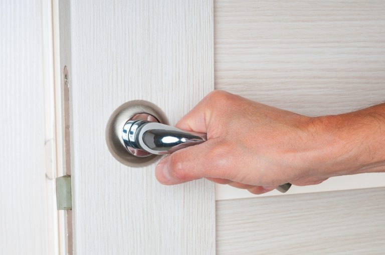
There are many other common improvements that we use for aging in place that likely go unnoticed because they are so common and attractive. Consider rocker light switches that are often installed in place of the older style toggle controls – or even using motion sensor light switches to turn lights on and off. Lever door handles used in place or round knobs likely won’t draw any notice because they are so frequently used, but they are effective nonetheless.
In the kitchen especially, and often in the bathroom as well, using a single-lever faucet is effective and quite common as well. No one is likely to comment on it being different or question why it is being used over a two-handle style.
There are many design features that we can use in creating effective aging in place improvements that are not especially noticeable as being special or different – or suggest why they have been used – that we can install for our clients to provide safer and more functional living spaces for them.
Guest Post by Steve Hoffacker:
Steve is an award-winning aging-in-place specialist-instructor (NAHB, “2015 CAPS Educator of the Year”), a universal design trainer-instructor, and award-winning new home sales trainer. Steve has written and published several books on universal design, aging-in-place, and new home sales. Since 2007, he has educated hundreds of remodelers, general contractors, occupational therapists, physical therapists, health care professionals, interior designers, kitchen and bath designers, architects, attorneys, durable medical equipment providers, building materials manufacturers, university faculty, local and regional governmental and non-profit housing agencies.
For more great articles Visit: https://www.stevehoffacker.com/blog/

